Naluri App Experience Redefined

Enhancing Naluri’s interface and flow to drive engagement and user satisfaction

Role

UX/UI Designer, UX Researcher

Industry

Health & Fitness

Duration

3 months

a cell phone on a bench

Introduction

This adventure explores the redesign of the Naluri app, a comprehensive health and wellness services offering personalised coaching and support. The redesign focused on three key areas:

  1. Revamping the Design System: Streamlining the user interface for increased scalability, usability and accessibility.

  2. Rebranding: Aligning the visual identity with Naluri's core values of empathy, innovation, and empowerment.

  3. Reestablishing the Visual Identity: Initiating a cohesive and contemporary brand experience across all touch points.


The Challenge

Since its first launch in 2016, the Naluri app's appearance has remained relatively unchanged, despite the addition of numerous features over the years. As Naluri has expanded its reach from serving members in Malaysia to offering health coaching across Southeast Asia, the app's information architecture necessitates reorganisation. This will enhance the user experience by facilitating easier navigation and ultimately improve member retention and engagement.


Key Pain Point
  1. Lack of information hierarchy

  2. Cluttered information

  3. Lack of accessibility

  4. Supporting visuals are not inclusive

a cell phone on a bench
a cell phone on a ledge

DESIGN PROCESS: UNDERSTAND

Defining the Member

As part of this project, we've established user personas based on user activities, surveys, and interviews. These personas capture two key characteristics of our user base:


Reason for Joining:
  • Improve mental health

  • Work on physical health

  • Manage chronic disease


Motivation Level
  • Enthusiast

  • Episodic care

  • Explorer


Matters to address

To ensure the success of the redesign process, the team has identified several key issues to address, based on member feedback, leadership vision, and product requirements.


Address User Drop-off
Combat low engagement among younger users (20-30 year olds) by creating a more engaging and interactive interface.

Culturally-Sensitive Design
Foster inclusivity by avoiding offensive content, tailoring to diverse cultures, and offering relevant features.

Prioritize User-Friendliness
Create an intuitive interface with clear navigation and helpful resources for users with limited health app experience.

Accessibility for All
Focus on features for diverse needs, such as language options, assistive technology compatibility, and clear visual cues.

DESIGN PROCESS: IDEATE

Concept Exploration

Drawing inspiration from our user research, we've explored design concepts moodboard tailored to the needs of our two primary user groups, Episodic Care (Mental Health) & Enthusiast (Chronic Disease Management)


Concept 1: Pastel Gradient
  • Radiates calmness and peacefulness

  • Professional and lighthearted

  • Scalable & extending the brand


Concept 2: Hand-drawn pattern
  • Fostering empathy

  • Organic and evolving motifs

  • Emotional connection

Product Vision
Product Vision
Product Vision

DESIGN PROCESS: DESIGN

Key Areas for Improvement

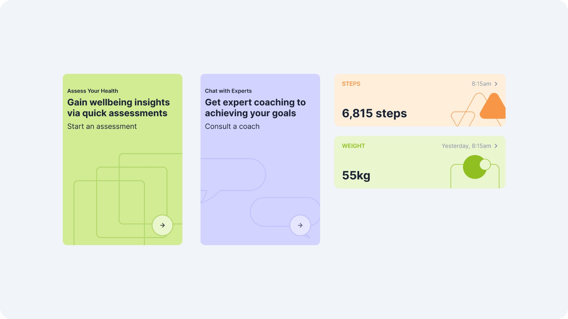
Following a thorough evaluation, design Concept 1 has been selected for its optimal alignment with our established requirements and criteria. Our proposal details key areas for improvement, outlining design principles, voice tone, and a prototype to showcase the future Naluri app experience.


Clarity
Decluttering text, simplifying visuals, and improving readability.

Accessibility
Standardising fonts, using neutral characters, and ensuring good contrast.

Cohesiveness
Utilising a modular layout and guiding user attention strategically.

DESIGN PROCESS: VALIDATE

Usability Testing

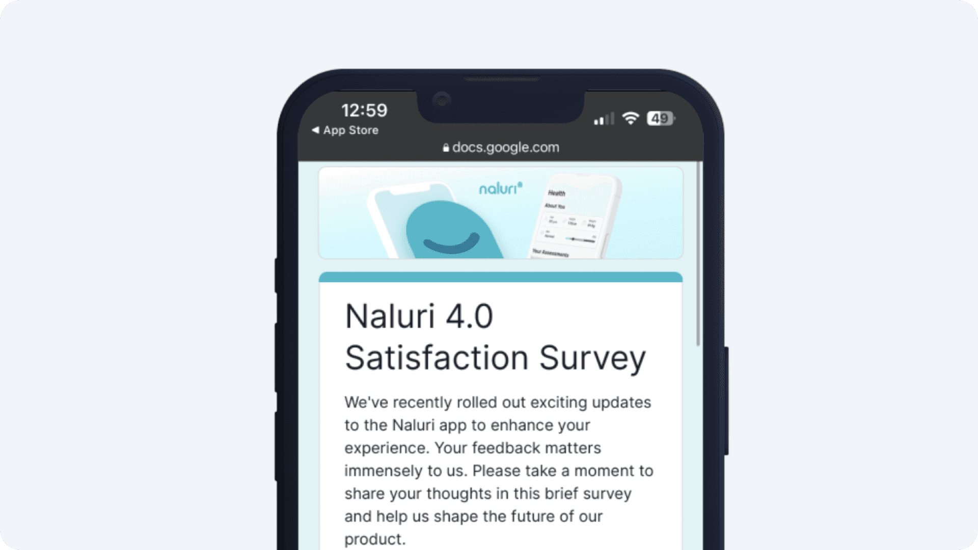
After securing internal stakeholder approval for design concept, we conducted user testing to validate if both existing and new Naluri members could navigate the redesigned app experience intuitively.

What we tasked the users to do:

  • Register a new Naluri account

  • Check your health progress

  • Update well-being assessment

  • Visit Learn and finish a lesson


Testing Insight

New experience and design was intuitive
Most participants found the new design and experience easy to use and navigate, praising its clean aesthetic.

Content shown needs to be personalised and relevant
Participants highlighted the need for personalised content relevant to their specific health goals.

Keep me motivated but also be practical
Users value features that keep them motivated while remaining flexible to their current needs and preferences.


OUTCOME

Final Design

Informed by our findings, we refined the concept design for finalisation


Typography

Naluri app redesign adopts Inter as its system font for seamless cross-platform use. Inter's diverse weights ensure readability across devices while maintaining a clean aesthetic.


Logo

Naluri's logo received a refresh, prioritizing scalability and incorporating subtle companion-inspired icons for brand cohesion.


Iconography

The Naluri app redesign utilizes the Unicons library by Iconscout for its iconography. This choice aligns with Naluri's design principles due to clean, legible, and cohesive design.


Colour Strategy

Building upon Naluri's existing brand colors, the redesign incorporates slight tonal adjustments. These refinements enhance both readability across diverse platforms and the emotional connection conveyed by each color, solidifying brand recognition while optimizing user experience and emotional impact.


Companion

To ensure neutrality, and enhance scalability, the Naluri app redesign introduces "Naluri Companions" replacing previous generic human figure. These non-threatening avatars personalise the user experience and provide emotional support throughout the wellness journey.

Challenges

Securing Stakeholder Buy-in for the Naluri Companions

Introducing the "Naluri Companions" as a core design element presented a unique challenge. Stakeholders were initially hesitant, unsure of user receptiveness towards the concept. To address this, the design team design that the Naluri Companions currently only appear in self-help sections of the app, such as lessons and assessments. To further balance user experience, utilise geometric motifs as supporting visuals alongside the Naluri Companions.


Staying within timeline constraints
Maintaining project momentum while adhering to time limitations demanded careful planning, resource allocation, and transparent communication with stakeholders. Some designs had to be scaled down to ensure feasibility and meet the launch timeline.


User Feedback

We conducted a user satisfaction survey two weeks after the Naluri 4.0 launch to understand our respondents' perspectives on two key pillars:


Product Perception

  • 63% of respondents expressed excitement about the new updates.

  • Respondents rated Naluri highly for being user-friendly, easy to navigate, easy to use, and having a good interface with a variety of content.


User Needs

  • Most respondents desired increased coach-led interaction and improvements in app stability and performance.

  • 60% of respondents ranked "Chat with Coaches" as their most used feature.

  • User interface was identified as Naluri's highest value proposition by respondents.


Reflection

Empathy-driven Design Matters

Naluri's success highlights the importance of empathy in design. By incorporating the "Naluri Companions" and prioritizing inclusivity, the app fostered emotional connections and addressed the diverse needs of its users.


Cohesive Brand Identity is Key

The redesign demonstrates the power of a consistent brand identity. Aligning the visual language across all touchpoints reinforces brand recognition, builds trust, and creates a seamless user experience.


User Experience Drives Engagement

The case study emphasizes the importance of prioritizing user experience. Streamlining the design, implementing intuitive navigation, and focusing on accessibility resulted in increased user engagement and active use of the app.

Other projects

Copyright 2025 by Akid Alias

Copyright 2025 by Akid Alias

Copyright 2025 by Akid Alias